BTC Mobick is a Korea-based blockchain company building an international enterprise blockchain hub.
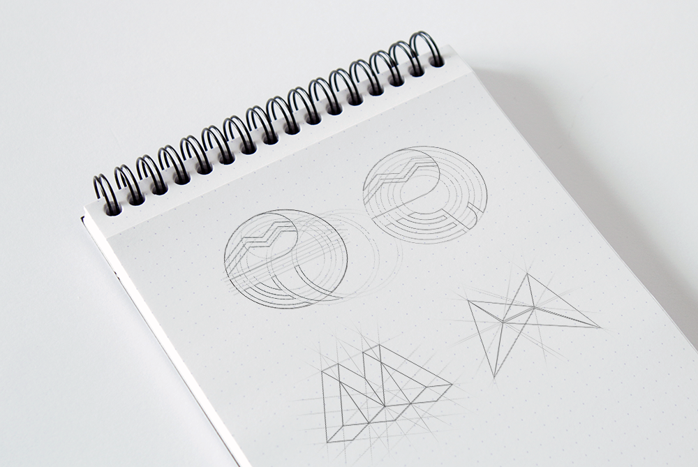
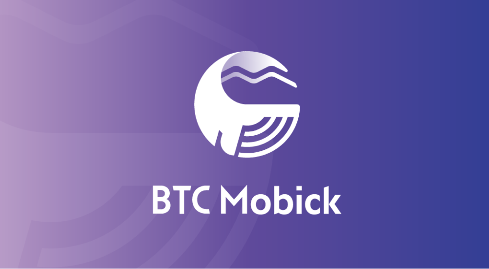
For BTC Mobick’s brand identity, we merged literary inspiration with web3 innovation, creating a logo that transforms the letter ‘M’ into a fluid whale silhouette – from the company’s Moby Dick-inspired naming. This symbolic approach establishes a distinctive presence in the web3 space while maintaining sophisticated simplicity.
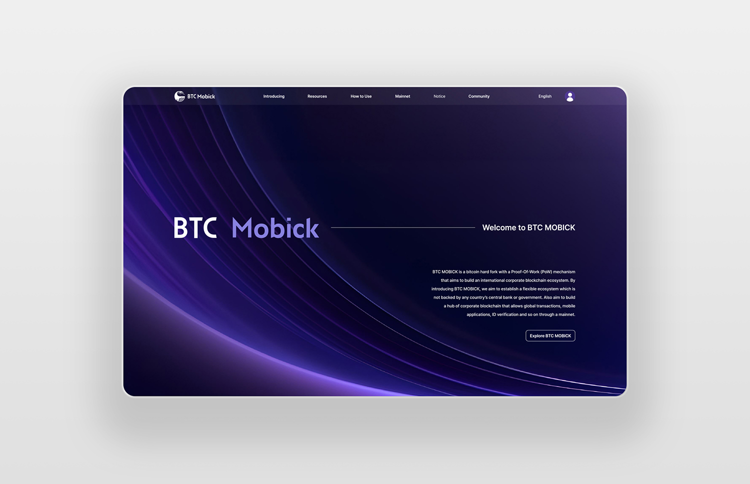
The responsive website design extends this concept through a refined interface that presents BTC Mobick’s coin information and features. A carefully selected color palette and clean layouts convey digital innovation and reliability, essential qualities for a web3 platform. The design system guides users intuitively through cryptocurrency details across all devices, balancing modern tech aesthetics with the mysterious depth suggested by the brand’s maritime inspiration.
credits
Design lead : Eva Park Designer : Hyemin Seo Development : All in web Project management : Clip chain